End Activity Session (Day 8)

Data visualization
docs and figsJust like it takes a lot of work to make a really wonderful graph, it takes effort to make a graph really awful. Put effort and creativity into this - you will learn a lot in the process if you do.
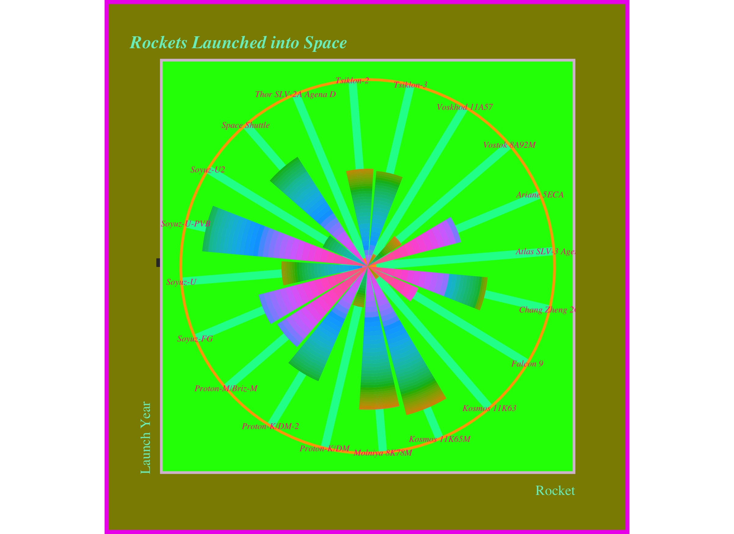
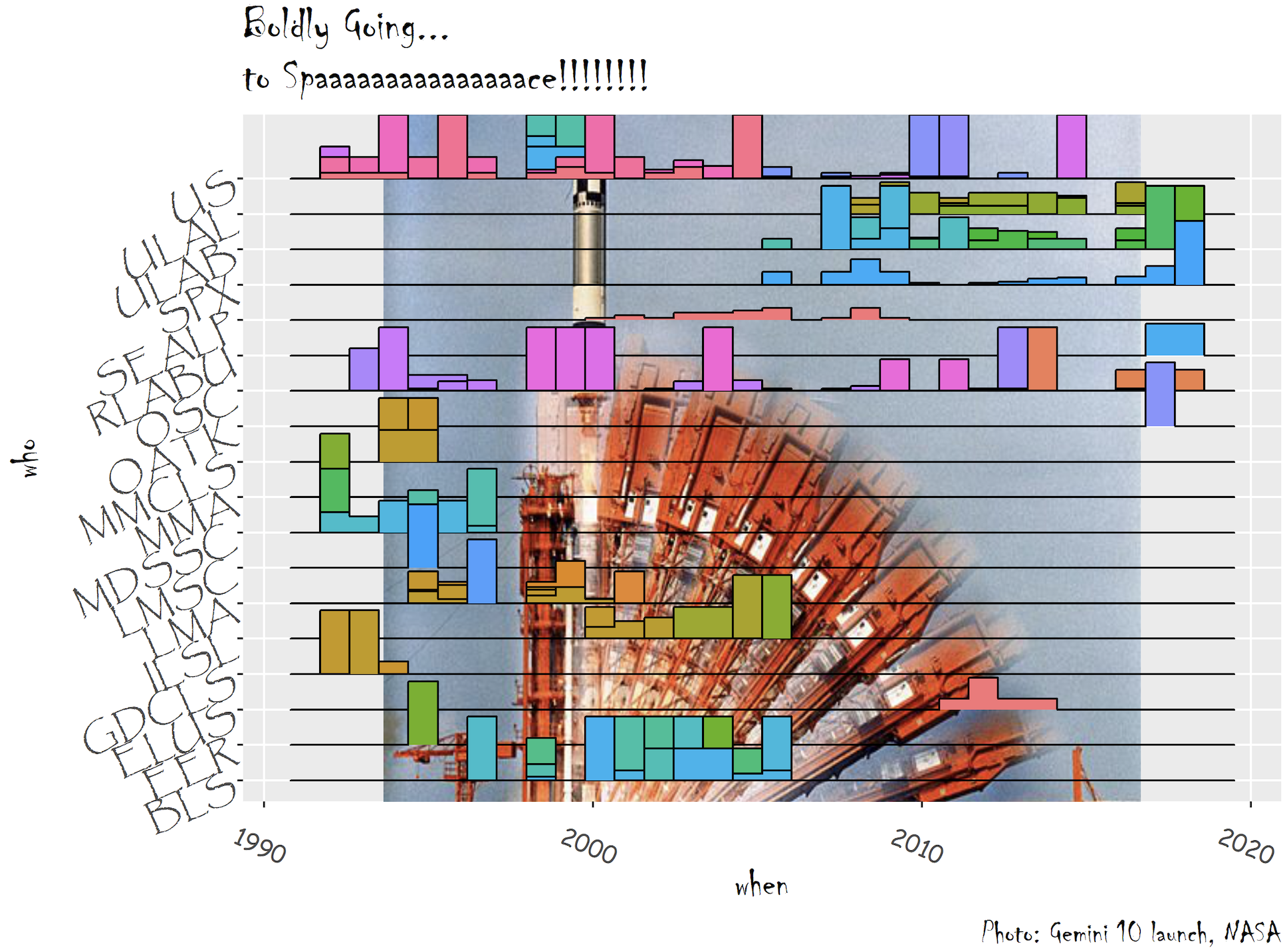
Using the ‘space_launches.csv’ data, create a new .qmd and create your worst possible graph by customizing (from the ggplot default) in at least 8 ways - more encouraged - to make it as terrible as possible. The data were previously shared for #TidyTuesday, and descriptions of dataset & variables can be found here. You can plot whatever variable(s) you choose, and make whatever graph type you want.
Once you’re done, drop your worst graph (as a .png or .jpg) into the course Slack channel.
Some ideas:
Here’s some inspiration from a few Bren MESM students.
By Yani Pohl:

By Keene Morrow:

Download the San_Francisco_Communitywide_Greenhouse_Gas_Inventory.csv file. Information about the data is available here.
Read in the SF emissions dataset, then complete the following:
Create a summary table of total annual greenhouse gas emissions (only from Emissions_mtCO2e column) by sector_general
Create a summary table of total annual greenhouse gas emissions (only from Emissions_mtCO2e column) by year and commodity type
Create a subset of the data that only contains observations from 2005 on, only for observations where Sector_Detail2 contains the pattern “PG&E”, then limit to columns Calendar_Year, Sector_Detail2 and Emissions_mtCO2e.
Create a finalized graph (as perfect as you can make it) using the San Francisco GHG emissions dataset. You get to choose what you want to visualize. You can pick which variables & observations you’re interested in. You may want to do some wrangling / summarizing first.
Once you’ve decided on what to plot, create the best graph that you can to communicate what’s going on with the data.
Once you’re done, drop your best graph (as a .png or .jpg) into the course Slack channel.
End Activity Session (Day 8)